The ad optimisation people
Main Content
What publishers say about OKO

“This move marks a significant step forward, ensuring we have the premium demand to keep up with our rapidly growing network of in-venue screens.”

Liam McCallum
Co-Founder and Chief Product Officer at Loop Media
![]()
“Collaborating with OKO has been a rewarding experience. Their unwavering commitment to excellence, solutions, and proactive support have optimized our ad business, and fostered a growth-driven partnership. OKO’s ability to adapt to dynamically evolving industry trends and their dedication to mutual success make them a great partner.”

Ivy Lin
Advertising Yield Associate, Ads Branding, ODK Media
![]()
The Ultimate Ad Monetization Toolkit
Expert Support
We link every publisher with a designated Google Certified expert from our team, providing not just support but a strategic passage to uncover opportunities, share growth strategies, and ensure your sustained success.

Premium Ad Demand
Collaborating with OKO opens the gateway to every major exchange and SSP, as well as a host of great smaller ones. We'll bridge the gap to determine the ideal mix of partners for you, granting access to premium ad demand, ensuring a competitive auction, and securing the best CPMs for every impression.

Smart Technical Solutions
We tailor the technical setup for each publisher, creating a customized blend of ad serving, auctions, and ancillary components to optimize your inventory and maximize your revenue. From setup to integration, we connect the technical aspects while providing seamless support for ongoing maintenance.
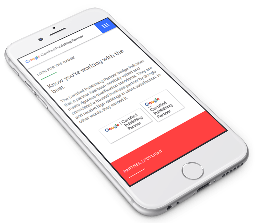
Google Certified Publishing Partners
Certified expertise
Everyone claims to be experts, but in our case Google agrees. OKO are proud to be recognised as Google Certified Publishing Partners, making us one of a handful of companies worldwide recognised by Google for expertise in Google Ad Manager and AdSense.
![]()